Gear & Apps
How to Choose the Best Paint for Your Photography Studio
Studio paint isn't just about color. The finish and shade you choose directly affect how light bounces across your set, how shadows fall, and how much time y...
Studio paint isn't just about color. The finish and shade you choose directly affect how light bounces across your set, how shadows fall, and how much time you spend fixing color casts in post. Getting the paint right means more control during the shoot and less work afterward.
Matte Finish Is the Industry Standard
Flat or matte paint absorbs light evenly and creates no hotspots or glare. Glossy finishes introduce unwanted reflections that complicate lighting and are nearly impossible to fix in editing. Rosco is the most trusted brand because its super-matte formulas are made specifically for studio conditions. For smaller budgets, Behr, Macpherson, and Dulux all offer quality matte options at a lower price point.
White for Brightness and Versatility
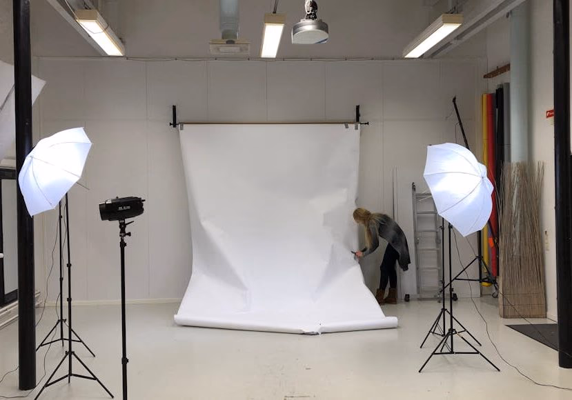
White studio walls reflect light back onto your subject, creating a natural fill that softens shadows and reduces the need for extra lights. White also simplifies compositing — clean separation between subject and background means faster masking. It works well for headshots, fashion, and product work. The trade-off: white can feel sterile in certain styles and may bounce too much light in small rooms.
Gray for Flexibility
Gray is the most versatile choice for a multi-purpose studio. It absorbs enough light to give you control while staying bright enough for clean backdrops. Light gray suits smaller spaces; darker gray works in larger open studios. Because a neutral gray introduces no color cast, it saves time in post-processing. If you're unsure which shade to choose, paint test patches and shoot sample images under your typical lighting before committing.
Black for Total Control
Black walls absorb nearly all light, making them ideal for dramatic portraits and product work where you want absolute control over every shadow. With a black studio, you flood the scene with light and subtract sources until you reach the exact look you want. The downside: you need more lighting gear because nothing in the room bounces back for free.
Other Colors
Chroma-key green is standard for compositing and video work. Bold primary colors can work for specific creative projects but lack the versatility of neutral tones.
Practical Tips
- Test paint samples before painting the entire room. Shoot under your actual lights and review on a calibrated monitor.
- Use washable matte paint on cyclorama walls to avoid repainting after every scuffed shoot.
- If you shoot both photo and video, light gray matte often performs better than pure white.
- Budget-friendly brands work well for non-commercial studios. Invest in Rosco-grade paint when you're charging clients.
Final Thoughts
The best studio paint matches your shooting style and your post-processing tolerance. White for bright, versatile work. Gray for flexibility and minimal color correction. Black for dramatic control. Whichever you choose, use a matte finish — because controlling light starts with the surface it hits.
FAQ
What paint finish should I use in a photography studio? Always matte or flat. Any shine creates reflections that interfere with your lighting and complicate editing.
Is Rosco paint worth the price? For working professionals, yes. It covers evenly in fewer coats, eliminates reflections, and holds up well under continuous use. For hobbyists, quality matte paint from a home store is usually sufficient.
What color should I paint a small home studio? Light gray or white with a matte finish. Light colors prevent the room from feeling cramped while giving you a clean, controllable background.